Ideal Work
Website
A new house was built
For a concrete company
A long and complex process that has led the company to review itself, its image, its way of communicating and ultimately its standing on the market.
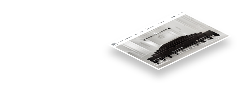
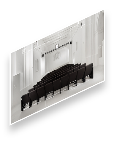
The renewal of the website was only one element of this process, though very important in the phase of recollecting and reshaping the whole twenty-years production.
Projects, courses, tutorials, reports, in the form of videos, photos, texts, have provided the material for pinning (marking) new starting point.
Agency
DigitalMindClient
Ideal WorkYear
2018Services
Art Direction, UX, Web Design, Graphic Design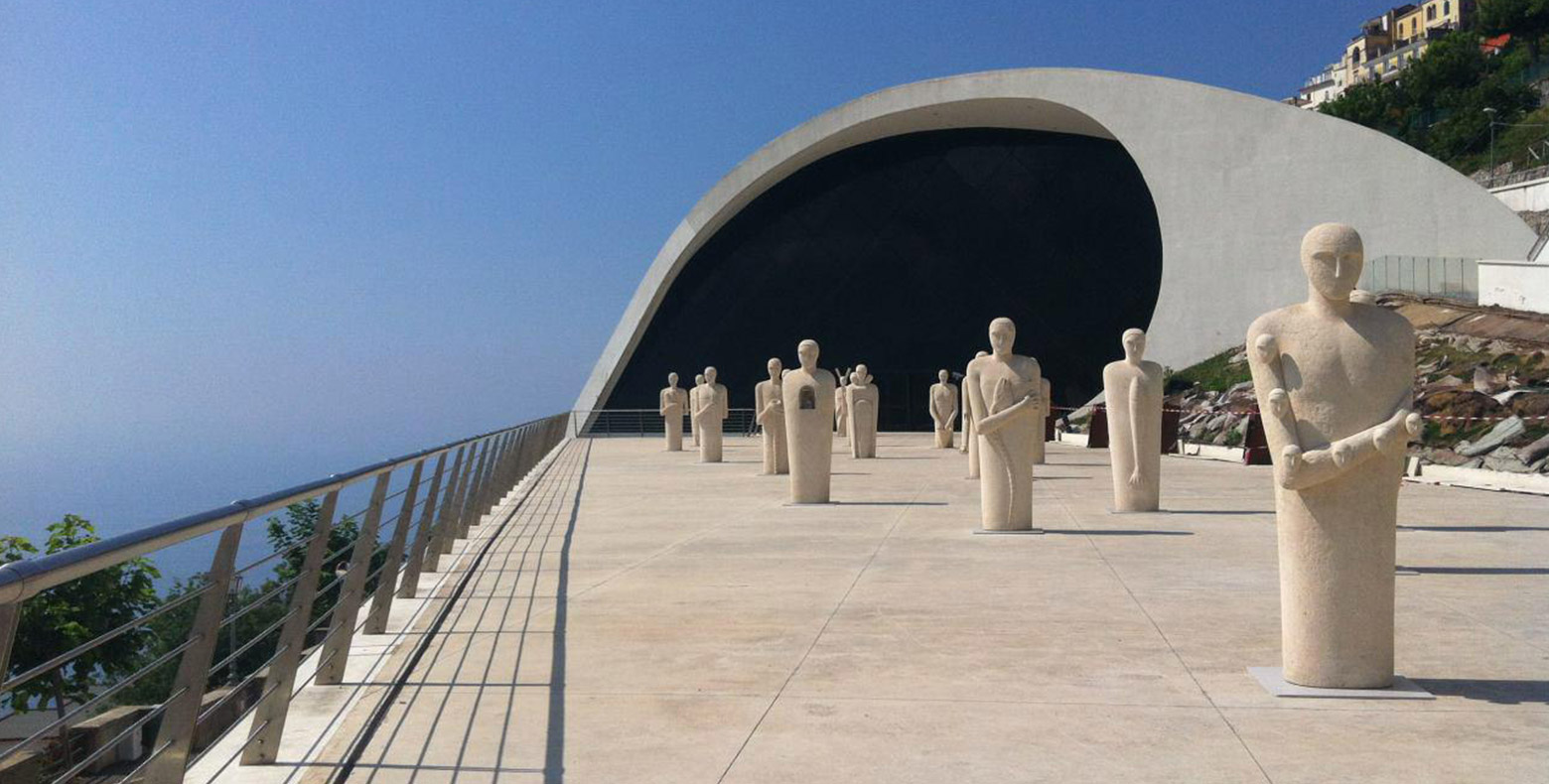
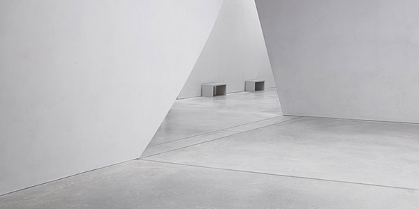
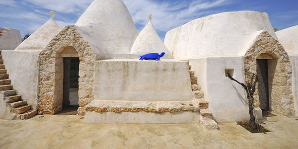
Projects and developments
as the hub of communication
If what one does is excellent there is no reason to hide or embroider on it. Facts speak for themselves.
Projects developed by Ideal Work in over 20 years have proved to be at the top in terms of quality and importance and its results are documented in accredited publishings all over the world. Examples of successful projects are:
OMA, Oscar Niemeyer, Tadao Ando, Zaha Hadid, Michele De Lucchi, BIG, Norm, B+B.
All of them meet that standard thanks to the quality of the products used and the availability shown by the company.
The images and repertoire material met the level of the names involved.
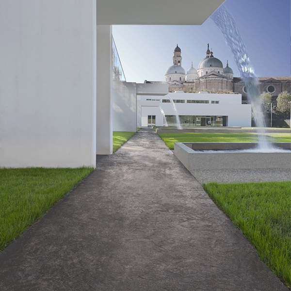
To restructure the architecture of the web site we put the creations at the center of the project: a large portfolio of works connected to the product sheets, as well as the application methods, allowed us to be thorough in the description of the company’s offer and at the same time functional to the user in meeting real and specific needs.
Projects
Emphasizing corporate values only through the use of effects.
As said, we didn’t want tingle or fireworks.
We borrowed the language of architecture , made of cleanliness, sobriety and rigor.
Empty spaces and clean typography had to be the elements to emphasize the images.
It was decided to add further elements only where necessary.
The homepage in its brand presentation function could be improved; the vocations of materials and products could be made more explicit by simply scrolling.
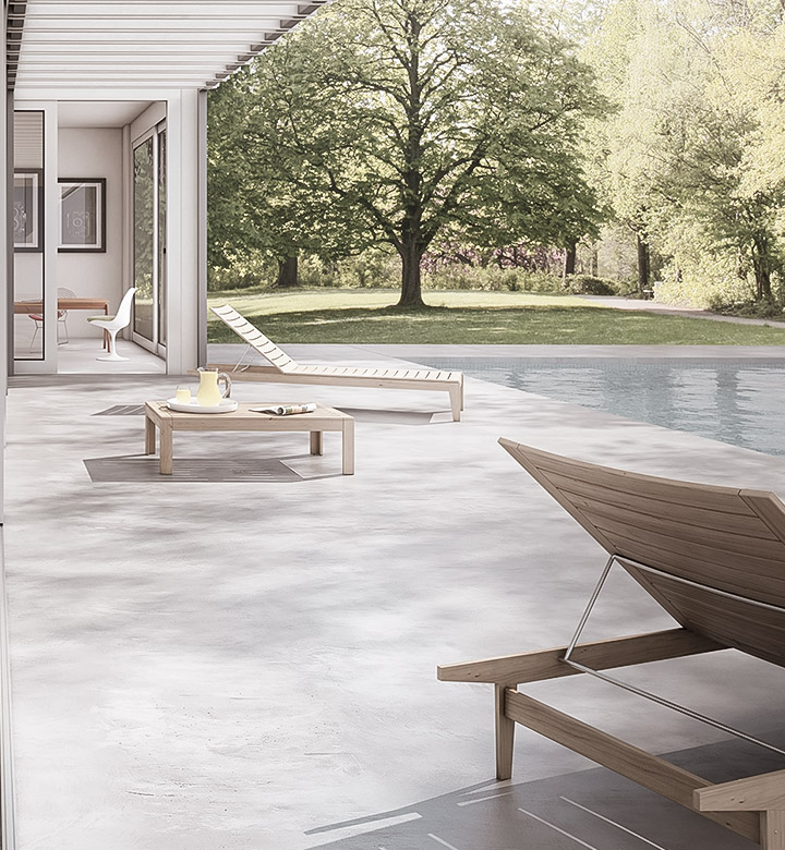
E.g. the photo of a villa split into inside and outside as a symbol of the two application possibilities; or even showing a room shifting from before to after to express the possible advantages in the field of building renovation; or making a cloud of innumerable contexts appear, testifying to the great versatility and flexibility of microconcrete.
The effect in support of the message.
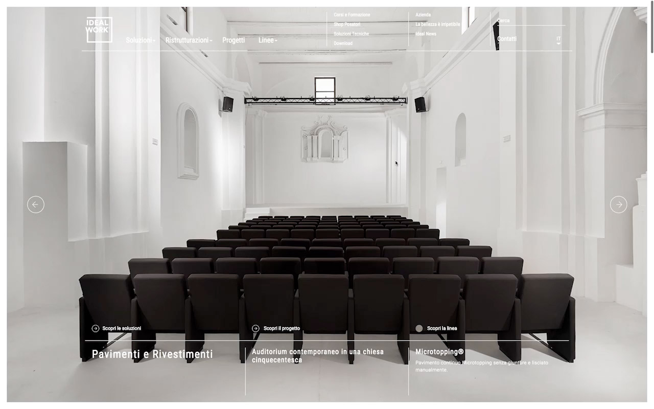
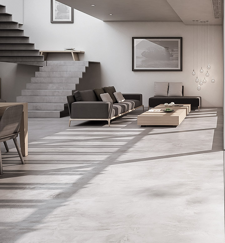
A website designed for all interfaces
Simply responsive, it’s an essential requirement.
